Recently I was assigned to create a simple Silverlight project that shows a list of data with full editing support. The first thing that comes to my mind is using the ClientUI project template as a first step to start working on this task.
After spending about 30 minutes trying all the project templates that come with Intersoft WebUI Studio 2011 R2 SP1, I decided to start the project using Intersoft ClientUI Ribbon Application template. This project template allows the creation of rich Silverlight application with rich Ribbon interface and integrated navigation interfaces.
Intersoft ClientUI Ribbon Application template is ideal to build business applications with relatively large modules and features. The template ships with predefined MVVM infrastructure that demonstrates how to use UXRibbonBar as a command placeholder that dynamically change its content based on the active module. It also includes fully-functional MVVM examples such as Mail and Calendar which are implemented with the advanced data controls available in ClientUI.
Building rich application using this Ribbon project template is easy and straightforward. In this blog post, I’ll share some of my experiences building the project such as adding the navigation, customizing the ribbon through XML configuration file, and drop-in the data grid to display data.
Let’s get started!
Creating a new project from the Ribbon Application project template
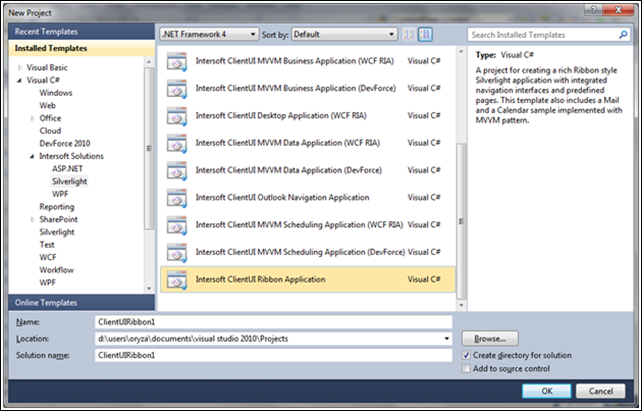
We’ll start by creating a new Silverlight project using Intersoft ClientUI Ribbon Application project template. This project template is available after install the Premier edition or Intersoft WebUI Studio 2011 R2 (or newer) for Silverlight and WPF. To create a new Intersoft ClientUI Ribbon Application project, open Visual Studio and select File > New > Project… (or press Ctrl+Shift+N) from the menu bar. Select Intersoft ClientUI Ribbon Application from New Project window. Enter the appropriate details to create the new application project.
One nice feature of Intersoft project template on New Project window of Visual Studio is that you can have the Intersoft project template grouped under Intersoft Solutions node of Installed Templates tree view.
The project template contains several predefined configuration, assembly references, and code files such as Assets, Factory, Selectors and several XAML files. Click here to learn more about the structure of this project template.
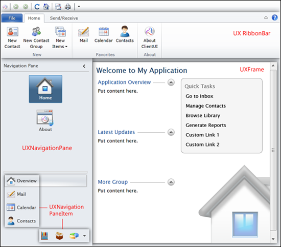
When you run the project for the first time, you’ll see a fully-functional user interface such as shown below.
Creating Inventory UXRibbon Structure
I’m going to add a new module which will show list of products. The module will have its own ribbon bar control which employs three buttons: add new data; edit selected item; and delete selected item.
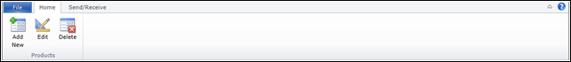
Three image files are added into the [SilverligthProject]\Assets\Images\Inventory folder as the icon for each of the button.
<?xml version="1.0" encoding="utf-8" ?>
<RibbonBar Name="Inventory">
  <RibbonTab Header="Home" IsSelected="True"
             ResizeOrder=""
             KeyTipAccessText="H">
    <RibbonTabGroup Name="Edit" Header="Products" MinimumSize="Large" IsCollapsible="false"
                    Icon="/ClientUIRibbon1;component/Assets/Images/Inventory/Inventory.png">
      <RibbonButton Content="Add New" MinimumSize="Large" TooltipHeader="New Item" TooltipContent="Create a New Item."
                    LargeIcon="/ClientUIRibbon1;component/Assets/Images/Inventory/AddExistingStandard_32.png"/>
      <RibbonButton Content="Edit" MinimumSize="Large" TooltipHeader="Edit Selected Item" TooltipContent="Edit Selected Item."
                    LargeIcon="/ClientUIRibbon1;component/Assets/Images/Inventory/Edit32.png"/>
      <RibbonButton Content="Delete" MinimumSize="Large" TooltipHeader="Delete Selected Item" TooltipContent="Delete Selected Item."
                    LargeIcon="/ClientUIRibbon1;component/Assets/Images/Inventory/Delete.png"/>
    </RibbonTabGroup>
  </RibbonTab>

</RibbonBar>
Instead of declaring the ribbon structure directly in the xaml page, the ribbon structure is defined in an xml file, RibbonInventoryData.xml. The file is located inside the [SilverlightProject]\Assets\Data folder.
RibbonFactory.cs class will read each element, attributes of the xml file; parse them to the appropriate object; and create the ribbon to be displayed.
Once the ribbon structure is configured, we need to initialize the ribbon data source and register the Inventory module so that the ribbon tab will be dynamically updated when user select Inventory module.
To initialize the ribbon data source, find InitializeRibbonBar() method in the RibbonPageViewModel.cs class and add a line as shown in the following code. *The class can be found in [SilverlightProject]\ViewModels folder.
private void InitializeRibbonBar()
{
    // Initializes application menu
    this.RibbonApplicationMenu = RibbonFactory.CreateMenu(RibbonDataFolder + "RibbonBarData.xml");

    // Initializes ribbon data sources
    this.RibbonData = new Dictionary<ModuleType, string>();
    this.RibbonData.Add(ModuleType.Overview, "RibbonOverviewData.xml");
    ...
    this.RibbonData.Add(ModuleType.Inventory, "RibbonInventoryData.xml");
}
Before running the project and showing the ribbon structure of Inventory module, we need to register the Inventory module in the UpdateRibbonTab method. UpdateRibbonTab is the method that will be invoked when users select a module.
internal void UpdateRibbonTab(ModuleType moduleType, object context)
{
    ...

    switch (moduleType)
    {
        case ModuleType.Calendar:
        case ModuleType.Contacts:
        case ModuleType.Inventory:
        case ModuleType.Mail:
            this.RibbonContextualGroups = RibbonFactory.CreateRibbonContextualTabGroups(RibbonDataFolder + this.RibbonData[moduleType]);
            this.RibbonTabs = RibbonFactory.CreateRibbonTabs(RibbonDataFolder + this.RibbonData[moduleType], context);
            break;

        default:
            this.RibbonTabs = RibbonFactory.CreateRibbonTabs(RibbonDataFolder + this.RibbonData[ModuleType.Overview], context);
            break;
    }

    this.ActiveModule = moduleType;
}
Save all the changes and run the Silverlight application project.
The ribbon structure for Inventory module has been successfully added. When users click/select the Inventory module from the navigation pane, the Add New button; Edit button; and Delete button will be shown.
Displaying The Product List with UXGridView
In this part, we are going to display a list of products. The list will be presented in an UXGridView control.
In this project, UXGridView is bound to WCF RIA Services. In this post, I will not describe in detail about how to configure the application to become WCF RIA Services-enabled; creating the data model; etc. I’d like to suggest you to refer to Intersoft ClientUI MVVM Data Application (WCF RIA SP1) project template. To learn more, see Walkthrough: Create New Intersoft ClientUI MVVM Data Application (WCF RIA SP1) Template.
Once the data repository of Products is completely added, Add UXGridView control and bind the ItemsSource property with Items property from ProductsViewModel; and bind each column of the UXGridView to their corresponding property of ProductsViewModel respectively.
<Intersoft:UXGridView Intersoft:DockPanel.IsFillElement="True" ItemsSource="{Binding Path=Items}"
                        AutoGenerateColumns="False">
    <Intersoft:UXGridView.Columns>
        <Intersoft:UXGridViewTextColumn Header="Category ID" Binding="{Binding CategoryID}"/>
        <Intersoft:UXGridViewTextColumn Header="Product ID" Binding="{Binding ProductID}"/>
        <Intersoft:UXGridViewTextColumn Header="Product Name" Binding="{Binding ProductName}"/>
        <Intersoft:UXGridViewTextColumn Header="Unit Price" Binding="{Binding UnitPrice}"/>
        <Intersoft:UXGridViewTextColumn Header="Units In Stock" Binding="{Binding UnitsInStock}"/>
        <Intersoft:UXGridViewTextColumn Header="Units On Order" Binding="{Binding UnitsOnOrder}"/>
        <Intersoft:UXGridViewTextColumn Header="Quantity Per Unit" Binding="{Binding QuantityPerUnit}"/>
    </Intersoft:UXGridView.Columns>
</Intersoft:UXGridView>
Save all the changes and run the project.
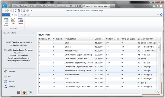
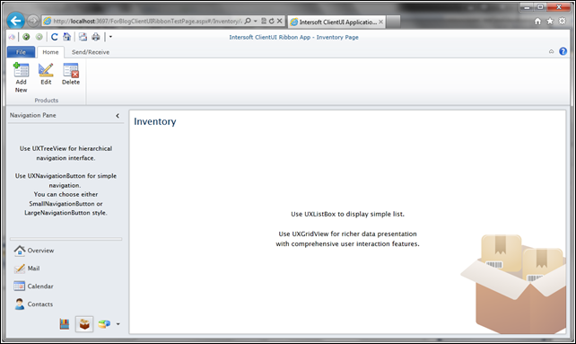
The Inventory module now has had a ribbon structure and will display a list of product in the ContentFrame.
Adding Commanding and Enabling/Disabling UXRibbon Button Based on UXGridView Selected Item.
In this part, I’d like to set the enable/disable state of each ribbon button based on the selected item of UXGridView. By default, the Add New UXRibbonButton is enabled since user should be able to add new item at any time. When no item is selected in UXGridView, Edit and Delete button should be disabled. They will be enabled when item(s) are selected.
In UXGridView, when a row is selected, the SelectedItem property will be automatically synchronized. I can bind this property to my ViewModel to capture the currently selected item. This property is then converted to a Visible/Collapsed and then consumed by IsEnabled property of UXRibbon button to determine whether the UXRibbon button is enabled or not.
Several questions arise when I started to check the feasibility to implement this approach.
- The Inventory.xaml page and the UXRibbon are located in different view. Each of them has their own ViewModel. Implementing converter seems not as easy as I thought earlier.
- The xml file of ribbon structure is processed by RibbonFactory.cs class by implementing parser. I need to ensure whether the ribbon button parser is equipped with binding parser or not.
I’m pretty sure there must be an elegant solution for a simple scenario such as this. So I decided to explore this project and hope to find an example that can be applied to my scenario.
After spending about 15 minutes exploring the project, clues are spotted when Mail module is opened. Some of the ribbon buttons are disabled when no message is selected.
This is exactly what I’m looking for!
It turns out that DelegateCommand play an important role in such scenario as shown in the Mail module. ClientUI provides DelegateCommand, a specialized command object that can be used to handle a delegate directly in the view model, and still can be bound to the view through binding. Furthermore, the DelegateCommand takes advantage of the routed command concept in which the IsEnabled state of the command sources will be automatically synchronized depending on whether the command can execute.
Many thanks to ClientUI development team who has extended the commanding framework to support MVVM through built-in DelegateCommand class. Not only this, they also have made this project template brilliantly. I mean it and don’t intend to exaggerate about what I say. Building Silverlight application based on Intersoft’s project template is considerably easy, even for beginners. I started to learn the implementation of DelegateCommand on Mail module and reset the plan to implement this scenario to be as follow.
There are three UXRibbon button: Add New; Edit; and Delete. Each button is bound to the AddAction; EditAction; and DeleteAction DelegateCommand respectively.
RibbonInventoryData.xml
<?xml version="1.0" encoding="utf-8" ?>
<RibbonBar Name="Inventory">
  <RibbonTab ...>
    <RibbonTabGroup Name="Edit" ...>
      <RibbonButton Content="Add New" MinimumSize="Large" TooltipHeader="New Item" TooltipContent="Create a New Item."
                    LargeIcon="/ClientUIRibbon1;component/Assets/Images/Inventory/AddExistingStandard_32.png"
                    Command="{Binding AddAction}" CommandParameter="AddNew"/>
      <RibbonButton Content="Edit" MinimumSize="Large" TooltipHeader="Edit Selected Item" TooltipContent="Edit Selected Item."
                    LargeIcon="/ClientUIRibbon1;component/Assets/Images/Inventory/Edit32.png"
                    Command="{Binding EditAction}" CommandParameter="Edit"/>
      <RibbonButton Content="Delete" MinimumSize="Large" TooltipHeader="Delete Selected Item" TooltipContent="Delete Selected Item."
                    LargeIcon="/ClientUIRibbon1;component/Assets/Images/Inventory/Delete.png"
                    Command="{Binding EditAction}" CommandParameter="Delete"/>
    </RibbonTabGroup>
  </RibbonTab>
  ...
</RibbonBar>
ProductsViewModel.cs
public class ProductsViewModel : EditableGridViewModelBase<Product>
{
public ProductsViewModel()
{
this.AddAction = new DelegateCommand(AddCommandAction, CanAddAction);
this.EditAction = new DelegateCommand(EditCommandAction, CanEditAction);
this.DeleteAction = new DelegateCommand(DeleteCommandAction, CanDeleteAction);
}
public DelegateCommand AddAction
{
get;
set;
}
public DelegateCommand EditAction
{
get;
set;
}
public DelegateCommand DeleteAction
{
get;
set;
}
...
private bool CanAddAction(object obj)
{
//this method validate whether or not AddNew button is active
//In this sample, I will keep this button to be always active
return true;
}
private bool CanEditAction(object obj)
{
if (this.SelectedProductItem != null)
return true;
return false;
}
private bool CanDeleteAction(object obj)
{
if (this.SelectedProductItem != null)
return true;
return false;
}
private void AddCommandAction(object obj)
{
MessageBoxServiceProvider.Show("add new row is performed", "Information",
Intersoft.Client.UI.Aqua.UXDesktop.MessageBoxButton.OK, Intersoft.Client.UI.Aqua.UXDesktop.MessageBoxImage.Information, null);
}
private void EditCommandAction(object obj)
{
MessageBoxServiceProvider.Show("edit selected row is performed", "Information",
Intersoft.Client.UI.Aqua.UXDesktop.MessageBoxButton.OK, Intersoft.Client.UI.Aqua.UXDesktop.MessageBoxImage.Information, null);
}
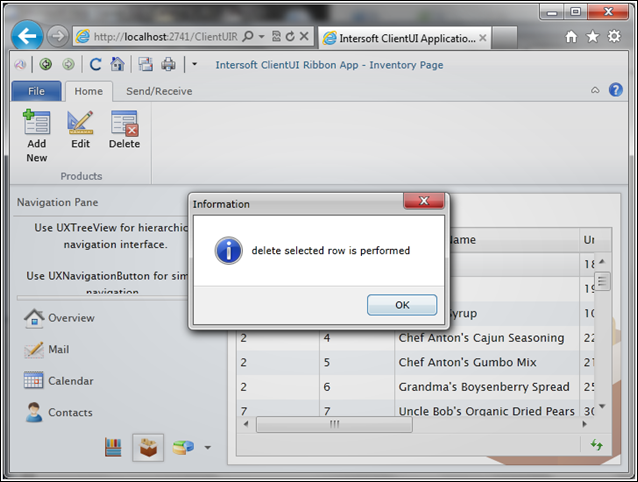
private void DeleteCommandAction(object obj)
{
MessageBoxServiceProvider.Show("delete selected row is performed", "Information",
Intersoft.Client.UI.Aqua.UXDesktop.MessageBoxButton.OK, Intersoft.Client.UI.Aqua.UXDesktop.MessageBoxImage.Information, null);
}
}
In the next series of my blog post, I will add a final touch to this Ribbon application by displaying detail information of data (for adding and editing operation) in a form.
Download Sample Code
For your reference, the demo project can be downloaded here.
I hope that this project will help you to prepare a simple demo project and provide you with insights about how easy to start developing Silverlight project using Intersoft Silverlight project template.
I’d love to hear your feedback so be sure to drop your comments in the box below.
Regards,
Yudi
 Intersoft Solutions Corporate Blog